

This report explores how online news content was discovered (and consumed) by computer users in the UK between mid-March and mid-April 2017. Based on a passive tracking study of the desktop and laptop web browsing of more than 3,400 online news users, it identifies the news brands that were most successful in driving social along with search and direct traffic from our sample during that period. Using two case studies (the Westminster terror attacks and the forced eviction of a passenger from a United Airlines flight), it shows the complex ways in which stories are found and consumed online and the role of different news brands and paths of discovery played in the development of each story. This research finds that:
-
- Three brands (BBC, Guardian and Mail Online) together accounted for two thirds of stories read (63%) and time spent (64%) amongst our total sample of UK news sites during the month.
-
- The BBC News website became even more important during the Westminster attacks as a source of reliable news. Three-quarters (76%) of all those who accessed any news story about the attacks used the BBC site and over half (55%) only used the BBC. Aggressive use of social and search allows some smaller brands to perform better around individual stories than they do on average, as illustrated by the Independent’s strong performance around the UnitedAirlines passenger eviction story.
-
- Different formats are effective for different types of stories. Live blogs were by far the most popular online format during the first 12 hours of the Westminster attacks, but a 53-second video was the key driver of the United Airlines coverage.
-
- Some brands are much more reliant on side-door traffic than others. Only 22% of visits to BBC news stories come from social media, search, and other links, with 78% coming from a direct path. This contrasts with other outlets like the Sun and the Independent, which generate the majority of their traffic via third-party referrals (e.g. search engines and social media). Many brands in the UK are struggling with low engagement (time spent) and low levels of loyalty (frequency of use), which is likely to make it hard to charge for content.
-
- In general, those using social media consume more news brands than those who tend to go directly to a news website or those who tend to search for news. Those who use social media more heavily access an even wider range of brands.
-
- Overall, our analysis shows a winner-take-all environment dominated by a few major brands, but also that distributed forms of discovery, such as social media and search, generally point towards more diverse news use than direct discovery.
Overview and Context
The growth of social media and other aggregators over the last few years has changed the nature of online consumption and discovery. This shift towards distributed discovery has been widely documented in our Reuters Institute Digital News Report (Newman et al. 2012–17). In terms of main access points for news in the UK, almost half is now focused on side-door routes (47%) rather than direct (53%), with younger users and mobile users even more likely to access this way of deriving news.
Most news brands have adapted their content for this distributed world, including developing new formats that are optimised for search and social media. At the same time, publishers are looking to nurture more regular usage directly to company website and apps and by developing email newsletters and mobile alerts (Newman 2016). The Digital News Report shows that although side-door access has increased significantly since 2012, the UK has a much higher proportion of direct traffic than most other countries. This is likely to be due to the existence of a highly competitive national media market, where strong newspaper brands vie with broadcasters like Sky and the BBC. Recall-based surveys are useful for understanding these general trends over time and across countries, but are often not the best way to understand more granular online behaviour around brands and specific content. To take a more detailed look at this, we have focused on behavioural data tracking a large sample of news users over four weeks.
Methodology and Limitations
This study is based on tracking the news consumption of desktop and laptop users in the UK from YouGov’s PULSE panel during the four weeks from 13 March until 10 April 2017. This panel is made up of more than 6,000 active computer users (desktop and laptop) who have given YouGov permission to track their online behaviour anonymously. Of these, 3,455 people accessed at least one news story from 21 designated online news brands in the UK and, in turn, this group accessed a total of 179,539 news stories over the month. We focus on the behaviour of these online news users. In the data, the figures have been weighted to national adult online desktop population for gender and age, as suggested by YouGov.
Our news universe was defined by the online news output of the most popular UK brands in the annual digital news report. They include the BBC, BuzzFeed, Channel 4, Daily Mail, Huffington Post, Daily Mirror, Sky News, Daily Telegraph, Sun, The Times, Yahoo News, Independent, ITV News, Lad Bible, Metro, Daily Express, London Evening Standard, Guardian, and MSN. We also added Breitbart and the Canary as we were interested to find out more about the usage profile of these hyper-partisan news sites in the UK.
It is important to note that we do not measure all news content that is consumed in the UK. We have excluded stories by UK consumers from foreign outlets such as CNN, the New York Times, Al-Jazeera, and any foreign language output not included in the list above. Individually, the brands that make up the so-called ‘long tail’ have a small reach with UK users, but together with blogs and other citizen journalism, they account for a significant amount of consumption. We also cannot measure stories consumed within platforms such as Facebook, Twitter, Google,or Snapchat. Our study therefore excludes the consumption of headlines or snippets within distributed environments or native consumption of articles via Facebook Instant Articles,
Google AMP, Apple News, etc. It also excludes short or live video consumption within distributed platforms, such as that produced by Now This or AJ+, as well as by the news brands listed above. In this study, we only look at desktop traffic. This is partly because mobile consumption, which is split between website and apps, is notoriously difficult to track, particularly at an individual story level. It is also hard to identify paths to content correctly on mobile. Our Reuters Digital News Report suggests that at a brand level, there is little difference between desktop/laptop and mobile in terms of weekly reach, with the exception of Sky News and BuzzFeed, which both do much better on mobile, and MSN News, which does better on desktop. In terms of paths to content, however, survey evidence suggests that social media are much more important on mobile than on desktop and laptop. In this respect, the path data shown here are likely to significantly over-represent direct traffic and significantly under-represent social paths when looking at overall news consumption.
In order to test our methodology, we compared our panel-based tracking data with logfile data obtained from both the Guardian and the BBC for traffic to desktop content from the UK for a single day in February. The percentages for traffic from different paths in the YouGov panel – social along with search and direct traffic – was broadly similar in these tests, which gave us confidence in our results. However, the comparative data set obtained from the BBC and the Guardian also confirmed our assumption that there is a radically different discovery pattern for mobile content, with social media being far more important in the mix.
Given these points, it is important to clarify that our sample does not represent the total news universe in the UK. It does cover the most popular news brands in the UK and a significant proportion of online news consumption, but does not include mobile web use, distributed consumption, and apps, or offline news. The distinct advantage of our approach is its granularity, allowing us to analyse digital news use at the story level and across brands and forms of discovery, something that other forms of analysis do not allow.
Key Findings
Top Publishers over the Period
These data show the extent to which desktop news consumption in the UK is dominated by three brands: the BBC, the Guardian, and the Mail Online. Together they accounted for 63% of all the stories read in our news sample and 64% of time spent over the month studied. Other national brands, such as the Daily Telegraph, the Independent, the Daily Mirror, and the Sun, accounted for a very small percentage of the overall number of stories read (between 2 and 4% for each brand) and a similar proportion of the overall time spent. 1
Figure 2.1: Publisher share of news stories read – desktop/laptop, Mar–Apr 2017
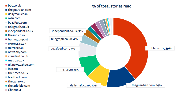
Share of 179,539 stories from 21 selected news websites (10 March–10 April 2017)
One surprise is the high ranking of MSN, which aggregates stories from a number of other publishers. MSN comes closely bundled with Microsoft email and browser services, which accounts for its strong performance on desktop. As already noted, it performs less well on mobile, where it does not have these advantages
Loyalty and Engagement Varies Widely between Brands
The next chart presents an overview of how different publishers performed during the four weeks covered, expressed in terms of the percentage of all stories read they account for, the average number of stories each person who visited that brand read over this period, the average time spent per user, and the percentage of all time spent. The percentage of stories read and of time spent gives an indication of the relative share of total news use an individual publisher accounts for, the average number of stories read, and the average time spent, illustrating the depth of engagement amongst those who do use a given brand. The Daily Mirror, for example, accounts for about ten times as many stories read and time spent as Breitbart, but the average Breitbart user reads almost twice as many stories from that site and spends almost twice as much time on that site as the average Mirror user.
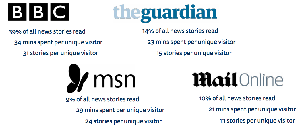
If we define engagement as the number of stories per visitor over the month, we see that the BBC tops the list with an average of 31 stories per unique visitor, followed by MSN (24), the Guardian(15), BuzzFeed (14), the Mail Online (13), and The Times (9). No other UK national publisher has an average of more than five stories accessed by each visitor per month. Publishers like the Sun and Mirror, which have managed to build up huge loyal readerships in print, are generating just four and three stories per visitor each, with an average time over the whole month of just over four minutes for each publication.
The Telegraph has an average of five stories per visitor per month, with a total dwell time of five minutes for each visitor – a significantly less loyal readership than its long-time rival, the Guardian. The Independent, which recently shut down its print edition to become a digital only brand, manages just four stories per visitor, with an average visitor time of five minutes. These (low) levels of loyalty and attention, combined with heavy reliance on Facebook and Google for traffic, are likely to make it hard to monetise their readerships over time.
BuzzFeed attracts around three times as much traffic as fellow digital born brand the Huffington Post. During the period, 7% of news stories accessed were from BuzzFeed, with 14 stories per visitor and an average total reading time of 19 minutes. The Huffington Post had a lower share of stories read (2%) and its readers were far less engaged, with just five stories per visitor and an average total reading time of five minutes. However, it is important to note that it is not possible to separate BuzzFeed news stories from lifestyle content, so the greater engagement may be due to strongly performing non-news lists and quizzes.2
Figure 2.2: Top brand desktop/laptop performance: 13 March–10 April 2017
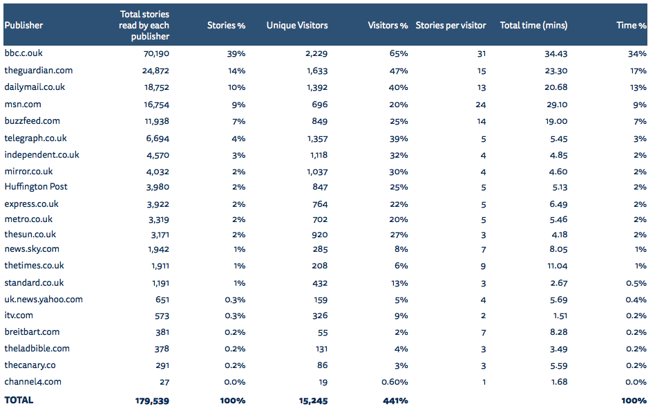
It should be noted that The Times, which operates a paywall, has a more loyal readership (nine stories per person), which spends around eleven minutes with the publication, though it should be highlighted that a significant proportion access The Times via its mobile and tablet apps (not covered in this study), so total time spent figures are likely to be much higher for this publication along with other engagement metrics.
Paths to Content
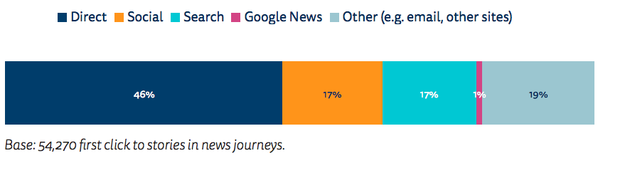
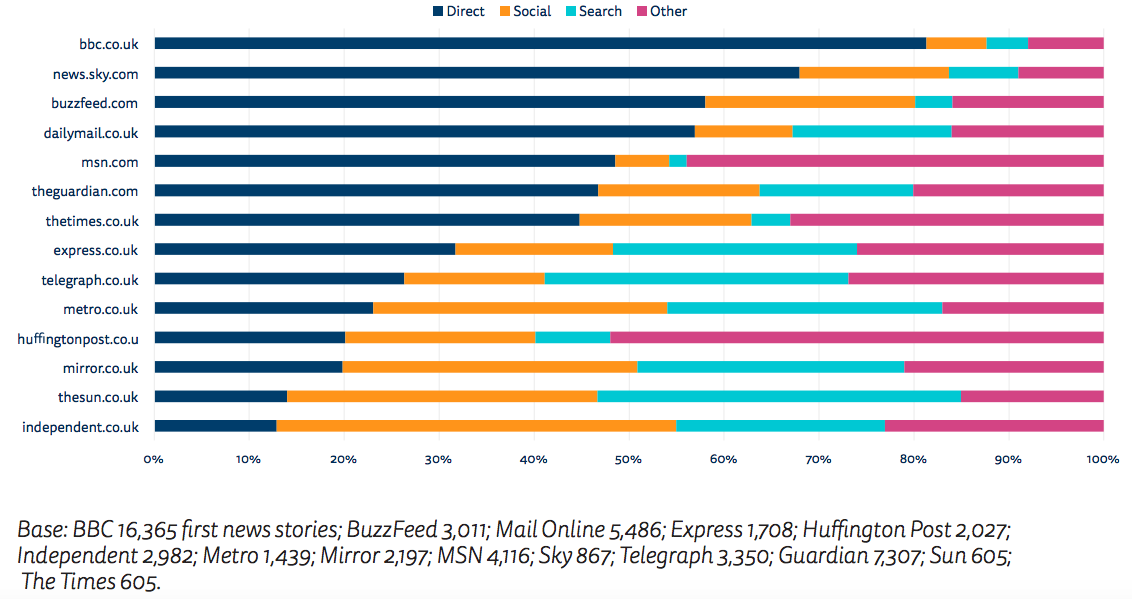
These data also allow us to see which routes panellists used to access news stories. Almost half of all engagements with news stories (46%) started with people accessing the story directly (i.e. from a homepage or other page on the website). This was followed by accessing via social media (17%), search (17%), and Google News (1%). Around one in five (19%) of news stories are accessed via other pathways – mostly email domains, links from forums and bulletin boards like Reddit, or links from Wikipedia, among others. We should note that these data refer to first click to any news story on our selected sites and excludes home pages and other index pages. The path profile this desktop traffic is different from mobile, where we know social media are a much more important driver of traffic (Newman et al. 2016, internal data from BBC and Guardian).
Figure 2.3: Pathways to news stories accessed
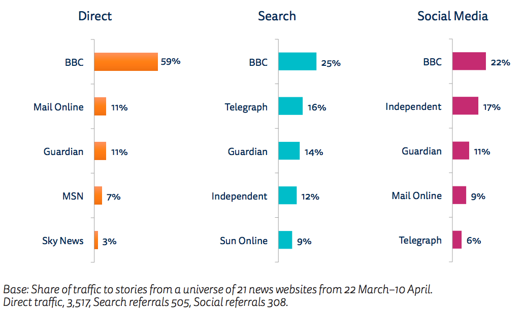
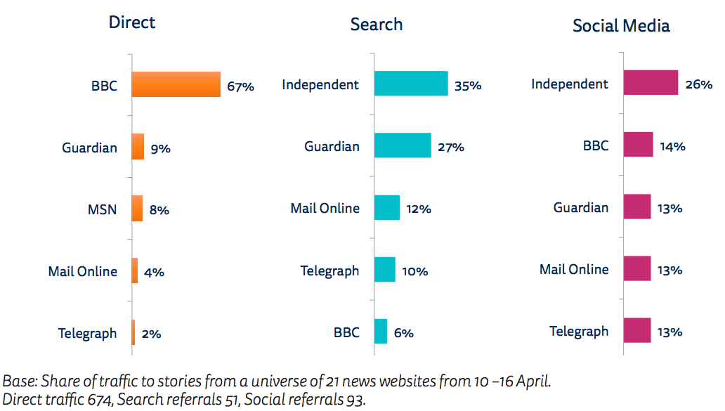
We find significant differences between brands in terms of pathways to news. Around three quarters (78%) of BBC traffic to news stories comes directly, with a quarter (22%) via referrals from a combination of search, social media, or other news sites. By contrast, brands like the Sun and the Independent get the majority of their traffic from a mix of social media and search, with the Independent being particularly reliant on performing particularly well via social. In our sample, only 14% of the Sun’s traffic is direct and only 13% of the Independent’s. The Telegraph, Mirror, and Express have higher traffic coming from search than via direct access. Many newspaper websites have been particularly focused on search engine optimisation over many years.
Figure 2.4: Paths to content by news brand
As previously noted, Yahoo and MSN drive much of their traffic from other paths (such as email and the integration with their wider search and portal businesses). 3
Top Publishers by Path
Splitting out the publishers by path (Figure 2.5) reveals the extent of the BBC dominance of direct traffic and the importance of distributed platforms such as search and social media for other publishers. The Guardian, Telegraph, and Mail Online outperform the BBC in search referral traffic, with the Guardian and Independent taking the top two places in social referral. In recent years, newspaper websites in particular have invested heavily in search engine optimisation and teams to drive traffic from Facebook and other social platforms. In the case studies (section 3), we can see how these techniques are deployed around specific stories such as the Westminster attacks and the United Airlines eviction.
Figure 2.5: Top publishers by path – all stories: 13 March–10 April 2017

Number of News Sources Used by Different Pathways to Content
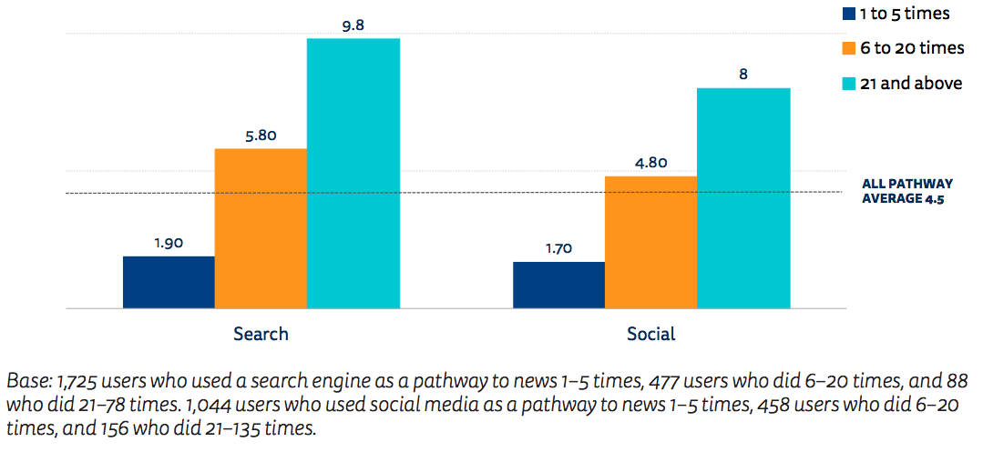
On average, the 3,455 panellists visited an average of 4.5 different news publisher websites during the four weeks covered. These numbers varied according to the pathways used as well as by frequency of use. Heavy users of search and social media accessed twice as many news sources as the average across all pathways. Those who used search engines more than 20 times to find news during the month visited on average 9.8 sources. Those who used social media more than 20 times to find news during this month got their news on average from 8 online outlets. These data confirm the findings in the 2017 Digital News Report that heavy users of search or social media tend to get exposed to more sources of news (and from a wider ideological spectrum) than those who go directly to news brands. Far from pushing people into echo chambers, those that reply heavily on side-door access tend to be exposed to a wider variety of news sources (Fletcher and Nielsen 2017).
Figure 2.6: Number of sources used per pathway by frequency of use
Case Studies
Tracking actual news usage via an online panel is particularly useful in exploring consumption around specific stories. Case studies enable us to see whether different types of stories affect the paths used to access news or the brands that are most heavily used. In this section, we explore how news was discovered and consumed around the terror attack on Westminster on 22 March 2017 and the forced eviction of a passenger from an overbooked United Airlines flight on 10 April 2017. We were interested to see the contrast between a big breaking news story where you might expect consumers to be looking for the quickest most reliable news and a compelling human-interest story, which aroused strong emotions. What role do different paths (search, social, and direct) play as a breaking news story unfolds? What role do social media play in spreading a story that generates strong feelings such as empathy and outrage? How do different publishers perform across different stories?
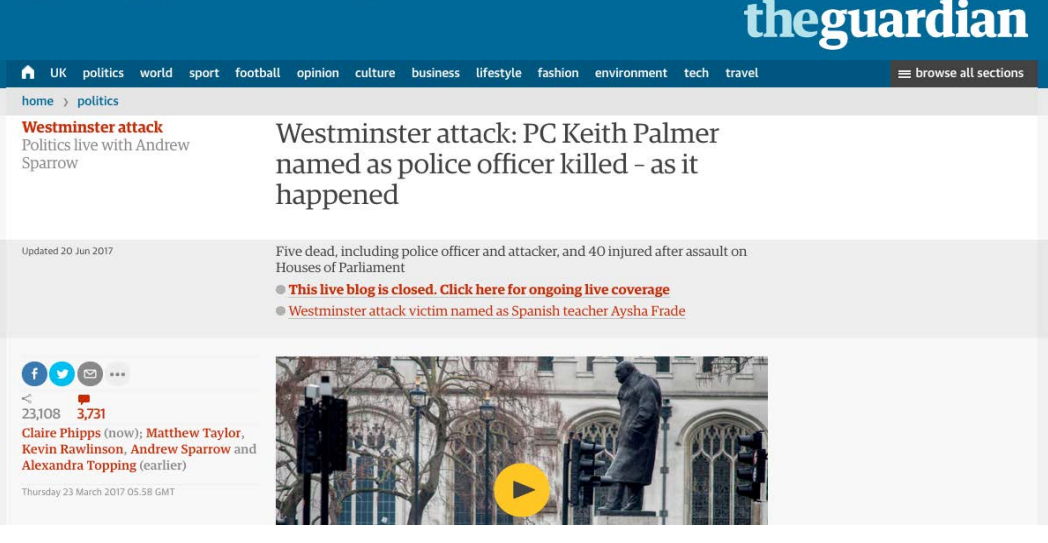
Westminster Attacks
The story
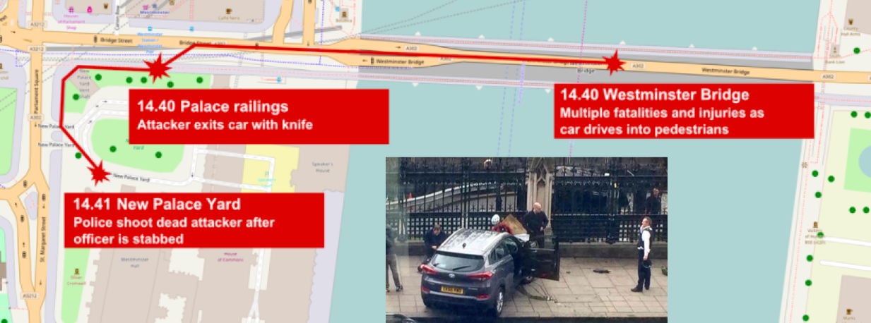
On 22 March 2017, a terrorist attack took place near the Palace of Westminster, home to the UK Parliament. The attacker, Khalid Masood, drove a car into pedestrians on Westminster Bridge, injuring more than 50 people, four of them fatally. Masood then left his car and ran into the entrance to the Parliament buildings, where he fatally stabbed an unarmed police officer. Using a set of keywords around the Westminster Attacks4, we identified 4,468 relevant news stories accessed by our panellists between 22 March and 10 April. This enabled us to analyse (1) which brands and stories were used, (2) how people arrived at the story, and (3) how the timeline of coverage unfolded.
Traffic overview
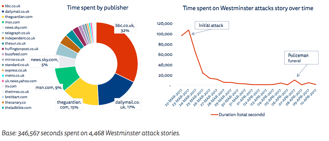
The BBC, the Mail, and the Guardian accounted for 64% of all the time spent with this story. This is not very different to the amount of time spent with particular publishers across all stories though the order of brands has changed. For the Westminster attacks, the Mail Online overtakes the Guardian to take second place and Sky News increases its share by five times compared with its monthly average. It is interesting and slightly counter-intuitive that traffic on the second day is higher than on the day of the attack. This is a common pattern and relates to the continued importance of morning reading habits as well as the way in which news consumers become invested in a big story over a 24-hour period, before attention wanes again quickly. Even with a big breaking story on a high-profile issue like terrorism, many people do not follow the news in real time.
Figure 3.1: Time spent per publisher for Westminster attacks – and total time by day
Detailed coverage
The first stories accessed by our panellists were from the Guardian, which was already running its live politics blog at the time the story broke (Live as it Happened) and the Mirror online, which was quick to start a page streaming live video coverage from Westminster. Within half an hour or so, however, we can see (Figure 3.2) the majority of users were turning to the BBC website – collecting more story views than all the other publishers put together and five times more than the Guardian. This pattern continues, with peaks in the story (e.g. the naming of the attacker) leading to a surge of direct traffic to the BBC.
Figure 3.2: Number of stories accessed by news brand, per hour (selected brands) 22–23 March 2017
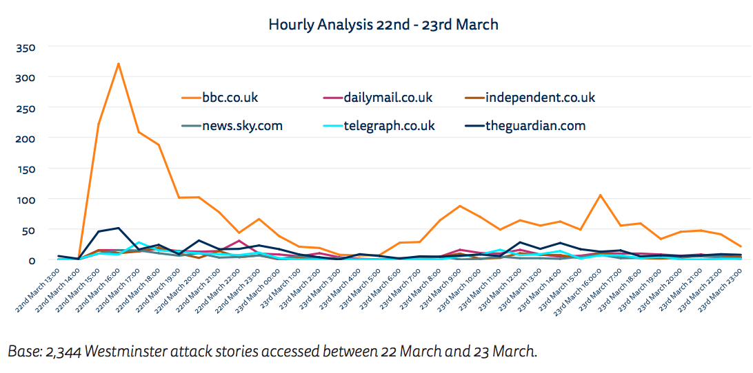
During the first hour, we can also see a number of search queries that specifically included the name of the BBC brand (e.g. terror attacks + BBC). This is another indication of how strongly the BBC News brand resonates at times of crisis. Sky News, which also has a strong reputation for breaking news linked to its 24-hour TV channel, was mentioned in a handful of search queries, but no other UK news brand appeared in the search logs examined.
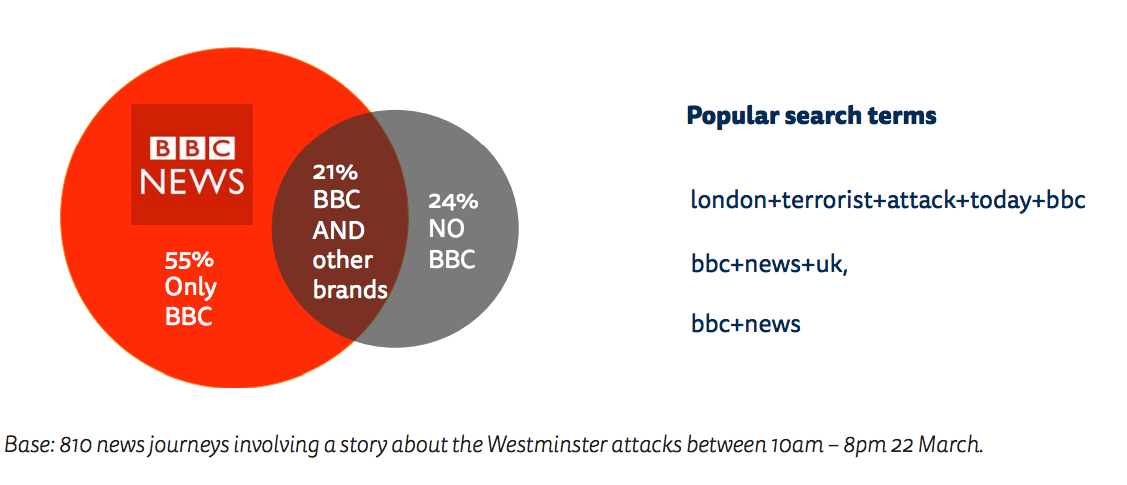
Overall, 76% of those accessing news stories on the first day of Westminster attacks used the BBC News website, with more than half (55%) only accessing the story via BBC News online.
Figure 3.3: BBC share of Westminster attacks coverage and overlaps with other providers 22nd March 2017
As the story developed, we can see some panellists using multiple brands to check different information. The BBC’s coverage tends to be cautious on major news stories and those hungry for the very latest information will often look at multiple news outlets or access news via search or social media feeds. We were not able to monitor consumption of the Westminster attacks story within Twitter and Facebook, but other studies (Newman 2009, Hermida 2010, Newman 2011) have shown that these networks are used as primary sources of breaking news, in conjunction with mainstream news sites. While the BBC was way ahead in terms of share of direct traffic, the split was much more even in search and social media, with the Telegraph, Mail, Guardian, and Independent all performing well. Our analysis suggests that most discovery paths are dominated by a few brands, but that this is much more pronounced when it comes to direct traffic than to search and social discovery.
Figure 3.4: Top publishers by path – Westminster attacks
The split needs to be put in the context of the overall traffic flows for this story, where more than two-thirds (72%) went directly to a news website and just 30% came via indirect paths such as social and search for this story. This is a much higher level of direct first click traffic than the average for all stories over a month. Not surprisingly, on a major breaking story, users are much more likely to go directly to a news website than in normal circumstances.
Figure 3.5: Paths to content, Westminster attacks: first click to stories in news journeys

Live blogs most accessed content type in direct traffic
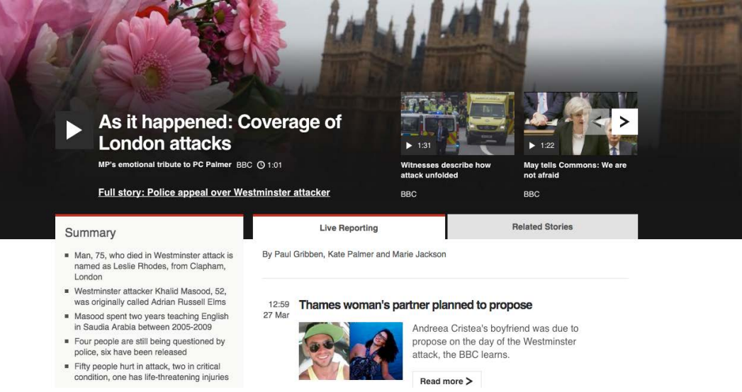
Looking in more detail at the most accessed pages and formats during this period, we find that live coverage/live blog pages do best. These pages combine a brief summary, along with short chronological updates (similar to how a social media feed operates). They also tend to incorporate eyewitness reports from social media, other reactions, as well as live and on-demand video. The BBC’s main live coverage page (see the screen grab) was accessed by 11% of those who accessed any content about the Westminster attacks from a direct path. The next most popular BBC page (the traditional article format) attracted less than half that traffic. The Guardian, which pioneered the live blog format around a decade ago, also ran a live page, which was by far its most popular story on the day and was used by 1.8% of all users to a direct path. Sky News also ran a popular live page, which includes live streaming of its news channel.
These formats are expensive to staff but have become a core way in which news publishers keep up to date with rolling news stories online. They enable updates to be delivered quickly without the overheads of a traditional editing process. The best of social media content is incorporated once verification and taste/decency checks have been applied. Our data show the popularity of these formats with readerships and also how certain media companies which are using them (BBC, Sky, and the Guardian) gain a significant advantage in breaking news situations.
The role of search
While the BBC, Guardian, and Sky focused on live coverage, other publishers looked to drive traffic from search. This involved getting the newsroom to monitor real-time queries in Google, such as ‘name+of+the+westminster+attacker’, and then adapt or write content that included these keywords or answered these core needs. The Independent was able to pick up a large number of search referrals with the story ‘London attack suspect: Pictures emerge of man believed to be Westminster terror suspect’, even though the name of the attacker was not released until around 8pm on the 22nd. The Mail Online’s trademark long headlines packed with keywords also helped them perform well in early search traffic with ‘Face of the Westminster attacker: Dramatic moment dying knifeman is stretchered away after being shot by police – as it’s revealed his car was a £32,000 4×4 Hyundai registered to affluent Essex area‘ (201 characters). The Telegraph is also expert at optimising content for search queries, and after the attacker’s name was released on the evening of the 22nd, it became the top performing story in the search path with ‘Everything we know about Khalid Masood, the London attacker’. Importantly, this ‘evergreen’ content continued to perform well over time, achieving 2% of all traffic from the search path during the month. Other stories specifically written to answer potential queries included the Sun’s ‘Who is MP Tobias Ellwood? London terror attack hero who gave mouth-to-mouth to police officer killed in Westminster tragedy’, along with biographical details of named victims.
Optimising stories for social media
In the hours that followed the initial news, the stories that resonated on social media, tended to focus on the emotional reaction or an argument of some kind reinforcing particular points of view. These stories tend to be widely shared or commented on, which in turn increases the likelihood of them being shown in other people’s feeds. The Independent had success with a story about the Muslim community raising £3000 in an hour for the families of the victims. This was a relatively small amount of money but presumably was being shared by liberal users keen to make the point that the vast majority of Muslims opposed the attacks. In total, this single story accounted for 2% of all traffic from the social path over the month. In a similar vein, the Guardian had a widely shared story about a woman who was photographed in a hijab walking past the victims on Westminster Bridge and her response to being abused online. This story generated considerable traffic from social media for the Independent, Metro, and the Telegraph. ITV gained a significant number of referrals from a story about Katie Hopkins and JK Rowling in a Twitter spat over the attack.
Social media also contained a large number of stories about the media coverage of the event.The Canary generated 1% of all traffic from social sources with an attack on the Sun’s heavy use of images of the injured, something it called ‘disaster porn’. Andrew Neil’s ‘Churchillian monologue’ created a social media hit for the Express, which got the most credit, even though the original video originated with a BBC broadcast. James Cordon’s video tribute to London was packaged by the Telegraph amongst other outlets. Given their emotional content, it is likely that these videos were watched heavily within social media feeds too, but as previously mentioned, our tracking methodology does not allow us to measure specific content consumed within Facebook or Twitter.
Number of brands used by path
Looking specifically at news use around the Westminster attack, we find that social media users accessed more sources of news (1.9) than those who came direct (1.5) or via search (1.2). As illustrated by the stories above, the range of emotional headlines seems to be what encourages clicks rather than loyalty to any particular brand. The intent behind direct and search traffic was likely to be focused on finding out more about specific aspects of the story – or to navigate quickly to a known news brand. In this context, it is not surprising that there is less spread of sources in this context.
Conclusions
While a strong core of news stories was accessed across all paths, there were also clear differences. Live coverage pages dominated direct coverage as viewers looked to find the latest verified information. Social media highlighted stories which played to emotional themes that were resonating with specific readerships and communities; stories that did best tended to be those that demanded some kind of reaction. By contrast, search helped answer questions that were already in people’s minds and provided a shortcut to the latest information being produced by multiple providers. For a major breaking news story like the Westminster attacks, computer users are more likely to go directly to a news website than in normal circumstances. They are also more likely to seek out a reliable and trusted source such as the BBC. On the other hand, both search and social media provide exposure to a greater variety of news sources and perspectives than might otherwise be the case – providing alternatives to the BBC.
United Airlines
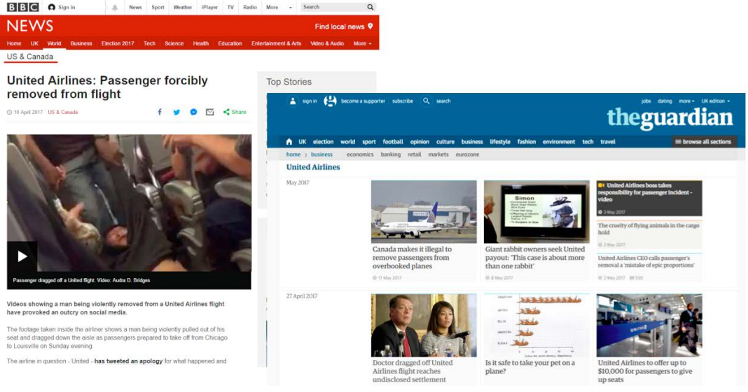
The story
On 10 April 2017, a doctor was forcibly and violently ejected from an overbooked United Airlines flight from Chicago to Kentucky after refusing to give up his seat. The resulting pictures and video were a PR disaster for United and led a storm of media coverage about the incident itself and the aftermath. Using a set of keywords around United Airlines 5, we identified 1,052 news stories accessed by our panellists from our 20 UK news publishers between 10 and 16 April. This enabled us to analyse (1) which brands and stories were used, (2) how people arrived at the story, and (3) how the timeline of coverage unfolded.
Traffic overview
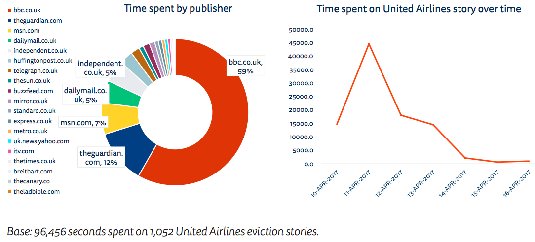
Over the entire period, the BBC accounted for 59% of the time spent with the story, followed by the Guardian with 12%, MSN with 7%, and the Independent and Mail Online with 5%. This is surprising given that one might expect more tabloid publications like the Mirror and Sun or digital-born publications like BuzzFeed to have made the running. This suggests that our wider news habits affect our choices and selections for an individual story. If people spend time generally going to the BBC News website or the Guardian online, they are likely to see the story there on the homepage or via a story-level recommendation module. As a point of comparison, our Digital News Report 2017 suggests that 47% access BBC News at least once a week whereas 35% access Facebook for news. As with the previous case study, we see that traffic on the second day of the story was considerably higher than the first. This is partly because the story broke late (UK time) on the 10th and partly because the hamfisted response by United management proved almost as interesting as the initial ejection.
Figure 3.6: Time spent per publisher for United Airlines eviction – and total time by day
Detailed coverage
The BBC wrote almost a dozen stories on the topic, including follow-up stories on the PR disaster and a background article about why airlines overbook. The seven most read stories were from the BBC, with the next three from the Guardian. The first stories accessed by our panellists were from the Telegraph, with the main BBC story not appearing until several hours later and the Guardian a few hours after that. Within a few hours, almost all outlets were running very similar stories, featuring the same dramatic 53-second video footage (user-generated by a Twitter user) at the top of the page. Later the story focused more on the reaction by the United Airlines CEO, and media and Twitter commentary.
Figure 3.7: Number of stories accessed by news brand per hour (selected brands) 10 to 11 April 2017
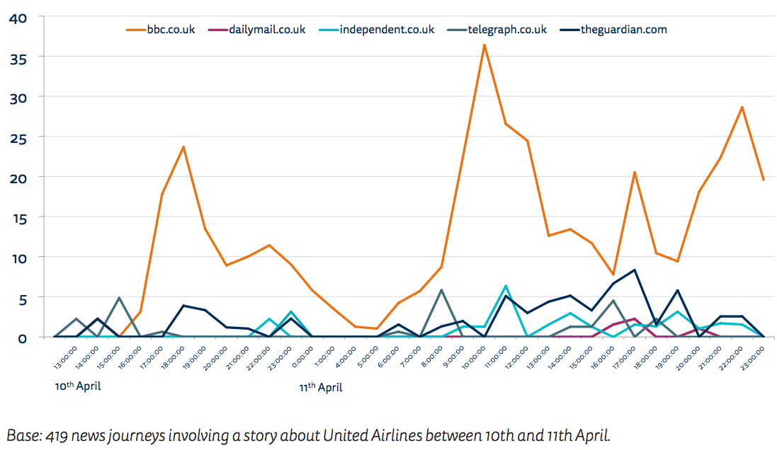
While the BBC did best for direct traffic, the Independent was the top publisher in both search and social media. This is an interesting example of a publisher dominating distributed discovery around an individual story ahead of other brands that usually attract more attention. Since becoming an online only publication, the Independent has focused its efforts on writing stories that resonate in social media and search and, unlike the BBC, these paths drive the majority of its traffic. A significant proportion of its traffic was to different video versions of the story, which it posted under multiple different URLs and then posted to social networks such as Facebook and Twitter. It created several versions of the video of the initial eviction, a video of reaction from other airlines, and a video of other media companies covering the story.
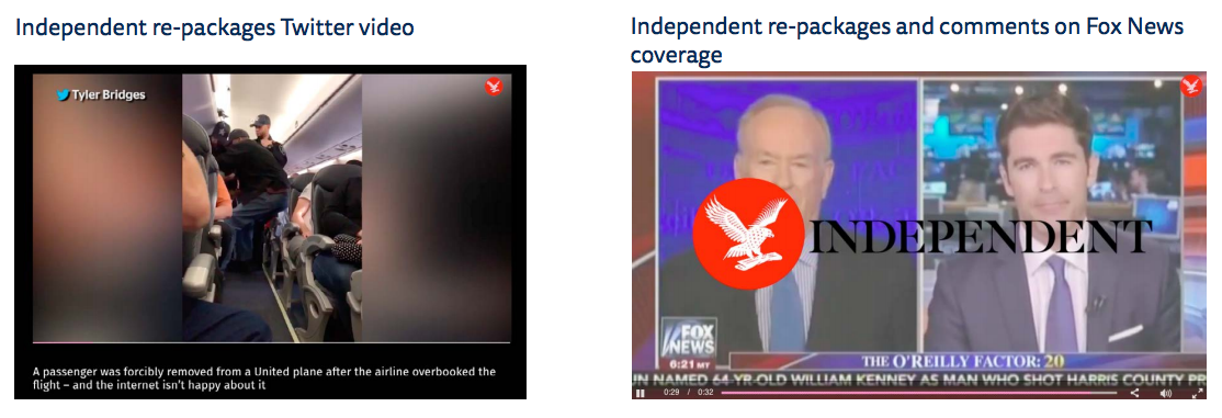
Figure 3.8: Top publishers by path – United Airlines eviction
Once again, the split needs to be put in context of the overall traffic flows for this story, where our study finds that three-quarters (76%) went directly to a news website and less than 30% came via indirect paths such as social, search, and email for this story.
Figure 3.9: Paths to content – United Airlines eviction: first click to stories in news journeys
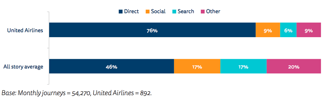
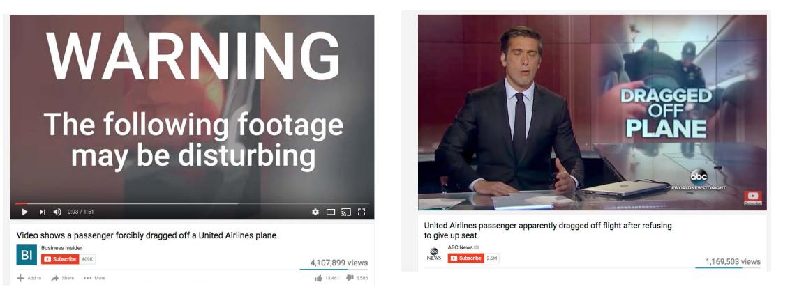
This is a much higher level of direct first click traffic than the average for all stories over a month and a similar level to the Westminster attacks. This seems surprising given that such an emotional story could be expected to have performed much better on social media. A likely explanation is that many people consumed the story within social networks using videos and pictures and in that context, links to external news websites were perhaps less compelling. It is a limitation of our tracking methodology that we cannot capture activity around news brands within social networks, but video consumption was extensive, with four million views generated for a widely shared Business Insider video and more than one million for one from ABC News. Our methodology also only captures UK-based news providers and it is likely that much UK consumption on this story came from US providers distributed via social media.
Figure 3.10: Videos consumed within social networks
Other coverage
Social media and mainstream reactions to the story provided a rich vein of amusement. BuzzFeed News repackaged material from Twitter hashtag #NewUnitedAirlinesMottos into a story titled ‘People Are Coming Up With New United Airlines Mottos’ and another round-up of Twitter reaction. It also referenced the spoof video by comedian and TV host Jimmy Kimmel. This highly popular video was also subject to searches via Google such as united+airlines+spoof+video. Search queries also included questions about airline overbooking in response to queries such as overbooking+flights. the Sun, the Independent, and the Mail Online wrote articles as well as the BBC and around 20 other news outlets. Readerships were also keen for information about the identity of the man dragged off the plane (who + was + the + man + dragged + off + the + united + flight). The Mail Online focused on the back story with another long headline designed for search (‘Doctor dragged off United flight was felon who traded prescription drugs for secret gay sex with patient half his age and took them himself – and he needed anger management, was “not forthright” and had control issues, psychiatrist found’).
Conclusions around United Airlines coverage
The United Airlines coverage in general was on the face of it quite similar to the Westminster attacks, with most of our tracked consumption coming from major brands like the BBC, the Guardian, and the Mail. However, there were some differences. Here a single dramatic 53-second video was the most consumed element, which defined the story in the early stages and was included on almost every page. There was very little difference between brands in terms of the scope of their coverage and virtually no exclusivity in the content itself. Partly as a result, the biggest brands with the biggest traffic did best in the early stages, with smaller online brands like the Independent and BuzzFeed proving to be more active later in pursuing angles that picked up the rising tide of interest in social media and search. As with the earlier case study, a huge amount of the coverage was derivative – sourced from Twitter comments, memes, and reactions or using recycled video from other broadcasters. As with the earlier case study, social media highlighted stories that played to emotional themes. Search was able to answer questions which were in people’s minds, notably around the background of the person evicted and the legal position around overbooking.
Overall Conclusions
This study tracking thousands of internet users over a month has provided new insights into the detail of online news consumption in the UK. The study shows how a small number of news brands, the BBC, the Guardian, and the Mail Online, tend to dominate news consumption in the UK, whether they get to those stories directly via search or through social media. The loyal usage these brands are able to generate means that they tend to perform well in general as well as around individual stories like the Westminster attacks and the United Airlines eviction. They
have an entrenched advantage through their brand reputation. Readerships seek them out directly and frequently.
By contrast, we have seen how other national brands, including both important newspapers and digital-born news sites, struggle to attract repeat visits and engage users online. Although the monthly reach of these brands is still significant, they are largely accessed through third-party gateways such as search and social. Speed or ingenuity can enable these brands to capture more attention for a particular story via distributed pathways, as in the case of the Independent in the United Airlines story, but this may not benefit them in the long term if this traffic cannot be effectively monetised.
Our case studies also show how third-party platforms have influenced the type of content being produced and the speed with which it is delivered. Stories were written specifically to answer reader questions from search while social formats (such as texted videos) are being deployed on news websites and distributed through social networks.
Finally, this research raises a question about the quality and range of online sources that are consumed. On the one hand, our study confirms that social media users access a wider range of brands than those who do not. On the other hand, it shows that much of the coverage duplicates; brands often draw on the same sources and follow the same approaches to format and storytelling. Further research would need to be done on a wider range of stories, including political and economic coverage, to understand whether and how digital media are extending or narrowing
choice in particular cases. It would also be useful in any future research to understand more about how discovery and consumption are different on mobile and to compare computer users and smartphone users.
Appendix Methodology
Tracking Different Paths
To identify the paths via which people access online news, we looked at the page they visited before reading a news story.
Direct
If the news domain name was the same as their previous page domain, they were considered direct. We included a check that the page was not simply a refresh. Homepages and index pages were tracked in order to understand the paths to stories but the story-based analysis presented here excluded these pages. The direct path data refers to the first click to a story (from any page on the site, including any homepage or index page visit or a click from another story on the website).
Search
Looking at the domain name of the page immediately visited before the news page, we checked against a list of google.co.uk, google.com (and other google varieties such as google Germany, Netherlands, Ireland, and Poland, which comprise a tiny fraction). We did not include Yahoo search for the survey sample (an oversight), but these searches made up no more than 1% of search traffic. To further refine the searches, we removed those which referred to google maps, google finance, google bookmarks, or put a full URL into the search (instead of a set of keywords). We also explicitly filtered those remaining search path URLs which contained the substring ‘q=’ and
extracted the query string itself. This allowed us to remove stop words such as ‘is’, ‘the’, ‘and’ (etc.) from the query list to refine checks on whether search terms appeared in the headline.
Social
Looking at the domain name of the page immediately visited before the news page included a social site or a short version (facebook.com; twitter.com; l.facebook.com; #facebook.com; t.co; bbc.in; bzfd.it; dailym.ai; trib.al). As the short versions can come from any social media platform, in these cases we checked the second page back before the news page to see if they came from Facebook or Twitter.
Weights
Each record for the web traffic analysis can be linked to a unique person that is part of the YouGov panel. Each of these panellists have shared age and gender information (among other descriptors) with YouGov and for that reason can be included in person-level weighting. In the process of weighting, age and gender were interlocked to create eight quota groups. Those groups’ sizes were adjusted to reflect the UK targets for the population of desktop users. In most web traffic studies, it is hard or impossible to link the web behaviour to unique people. Cookies can help with that partially, but they can only link to a device not a person (so will treat members of the household that use the same device as one person) and if they are deleted (and new cookies created) even the unique link to the device is lost. For that reason, it is impossible to weight the data to population targets (in the case of the project that only uses a subsample instead of the whole traffic). YouGov’s panel can link web behaviour to unique people who have shared demographic information (and remove any bots in the process), so allowing for a larger repertoire of methodology approaches.
The weight efficiency is high (88%). This means that the weights did not have to heavily up-weigh or down-weigh any panellists. The minimum weight factor is 0.6 and the maximum is 2.3. Good efficiency is due to the diligent recruitment process, where YouGov monitors the age and gender quotas of participants. Hence, the weighting only implements minor corrections.
About the Authors
Nic Newman is a journalist and digital strategist who played a key role in shaping the BBC’s internet services over more than a decade. Nic is currently a Research Associate at the Reuters Institute and is also a consultant on digital media, working actively with news companies on product, audience, and business strategies for digital transition.
Dr Antonis Kalogeropoulos is a Research Fellow at the Reuters Institute for the Study of Journalism. His doctoral work was focused on the effects of exposure to economic news. His research interests include political communication, journalism, and audience research.
Acknowledgements
The authors are particularly grateful to the team of data scientists and researchers at YouGov for flexibly accommodating our research design and adapting and iterating their systems to meet requirements. We are particularly grateful to Padraig Cleary for his painstaking work on checking and iterating the data capture in the light of feedback and to Mark Jefford and Charlotte Clifford for their analysis and insights, much of which has been incorporated into this publication. We would also like to thank the research team at the Reuters Institute for their advice on the research design and feedback on the implementation – in particular Richard Fletcher and Rasmus Nielsen.
Published by the Reuters Institute for the Study of Journalism with the support of Google and the Digital News Initiative.
- The unweighted numbers of the tracking data differ at most by two percentage points compared to the weighted numbers ↩
- The numbers for the Huffington Post are significantly lower than data from comScore or our own Digital News surveys. To test the robustness of our data, we compared them with comScore. In terms of average time spent per user, the R2 between our data from the YouGov PULSE panel and comScore data for this period is 0.63. The main outlier is the Mail Online which according to comScore has significantly higher time spent. Removing the Mail from the dataset, the correlation is 0.80 ↩
- The high direct traffic to BuzzFeed is hard to explain, given the highly distributed nature of its content, but we should remember that the mobile results are likely to look very different ↩
- Westminster OR ‘Westminster attack’ OR ‘Westminster terror’ OR ‘Westminster incident’ OR ‘Westminster bridge’ OR
‘Westminster AND hero’ ‘London attack’ OR ’Khalid Masood’ OR ‘London terror’ OR ‘terror attack’ OR ‘parliament AND terror’. ↩ - ‘United Airlines’, ‘United AND airline’ ↩